A quieter editorial portrait
Ease back strong colors in clothing or backgrounds so the face becomes the focus. Keep enough warmth in skin tones for a natural-looking portrait.
 StylMorph.
For a more muted, considered look, reduce saturation and soften contrast together. This filter adjusts the colors of your existing photo in your browser, so you can find a gentle finish and export the result as a PNG.
Open the free tool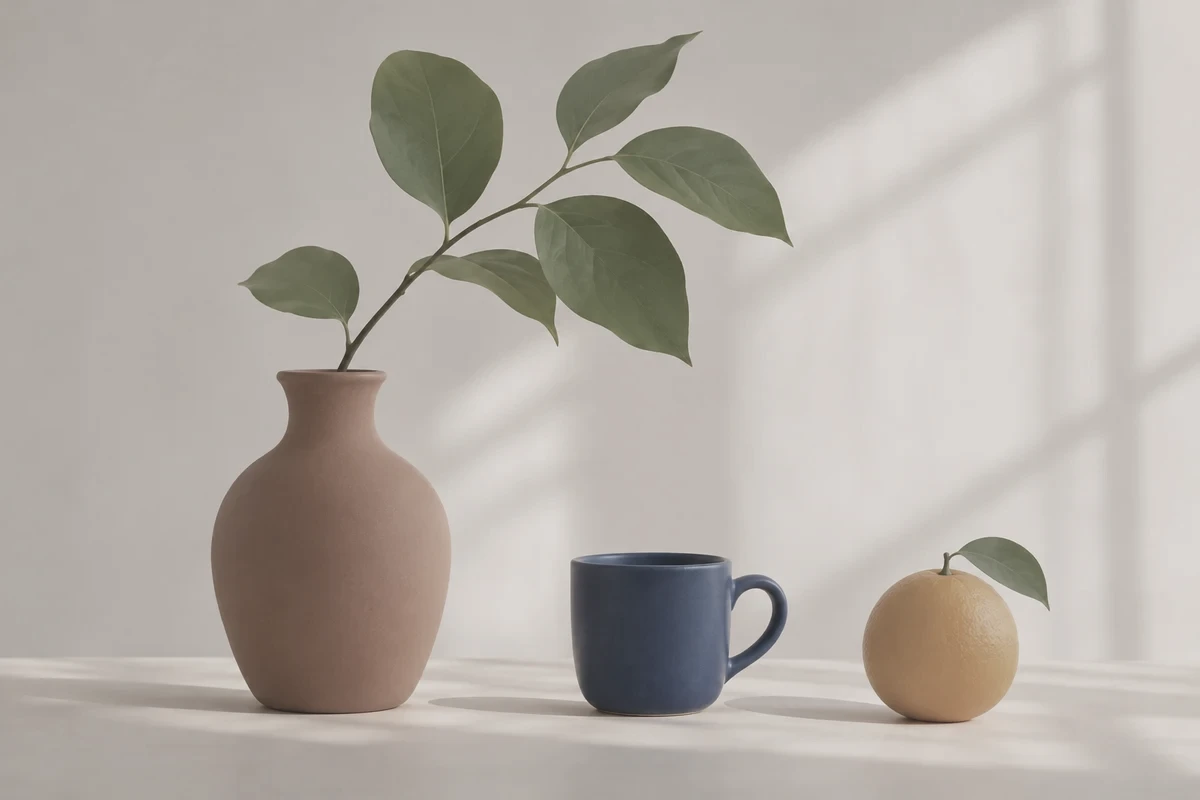
Upload a photo or start with the sample. Adjust it here, then download your PNG.
Add your photo
Drop a PNG, JPG or WebP here
Up to 10 MB · 24 megapixels
Reduce saturation and soften contrast for a quieter palette.
Opening the sample…
Free · Runs on your device · Your photo stays in this browser
Ease back strong colors in clothing or backgrounds so the face becomes the focus. Keep enough warmth in skin tones for a natural-looking portrait.
Bring differently colored images closer to a shared visual mood. Adjust each source by eye so one bright photo does not dominate the board.
Reduce competing colors in a banner or supporting photo. Check the edited image beside your page colors and verify any overlaid text remains readable.
Choose a source with visible detail in both light and dark areas. A muted treatment works best when there is useful detail to soften.
Reduce color intensity a little at a time. Stop while skin, food, or other important subjects still have the color character you want.
Soften contrast while checking the subject’s edges and the difference between light and shadow. Too much softness can make a photo look flat.
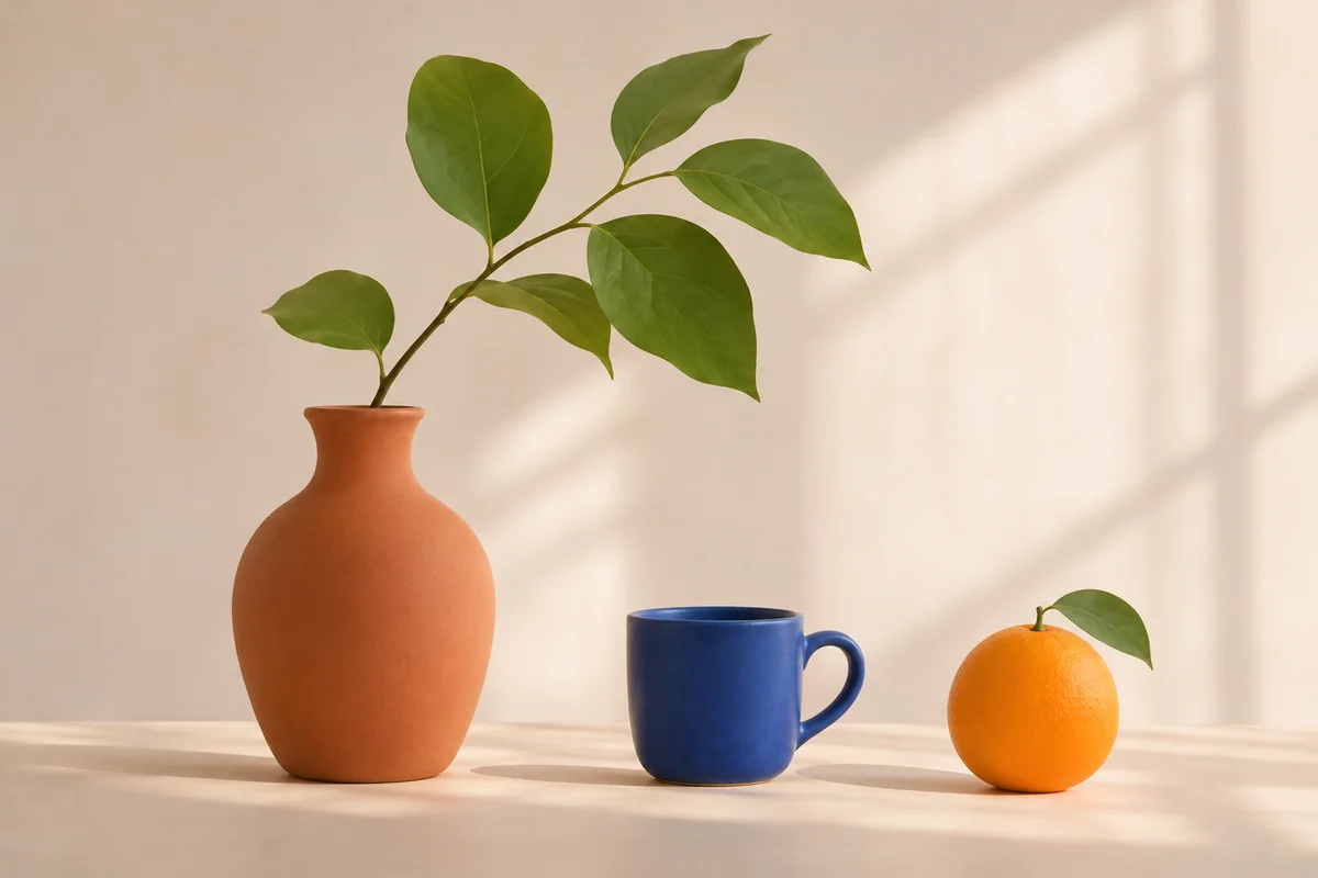
Use the left and right arrow keys to compare the original and edited image.
Open the image in the browser-based tool and look for the colors or shadows that feel too strong.
Adjust the muted effect to reduce saturation and soften contrast. Watch the subject as you compare the result with the source.
Export the look you prefer, then inspect it in the layout or profile where you plan to use it.
Increase the muted color strength gradually to reduce saturation and soften contrast together. Compare with the original and keep enough color and tonal separation for the subject to feel clear.
It reduces color intensity and softens contrast in your existing image. The composition, people, and objects come from the photo you provide.
A muted photo keeps subdued color. Grayscale removes color entirely. A gentle muted treatment can retain warm skin tones, soft greens, or dusty blues.
Use a lighter treatment and compare the face with the original. If skin starts looking gray or lifeless, reduce the effect until a little natural warmth returns.
A strong reduction in contrast can bring light and dark areas too close together. Use a gentler setting and look for clear separation between the subject and background.
Yes. Apply a similar degree of softness, then compare the photos side by side. Different lighting and source colors may need slightly different settings to feel cohesive.
The filter processes your photo in your browser without uploading it for editing. It uses no credits, and you can download the edited image as a PNG.
This is a color adjustment applied to the photo you choose. It changes saturation and contrast while keeping the existing composition and background.